Case study · Healthcare · UK
Helping visitors feel sure a therapist is the right fit
TL;DRThe outcome
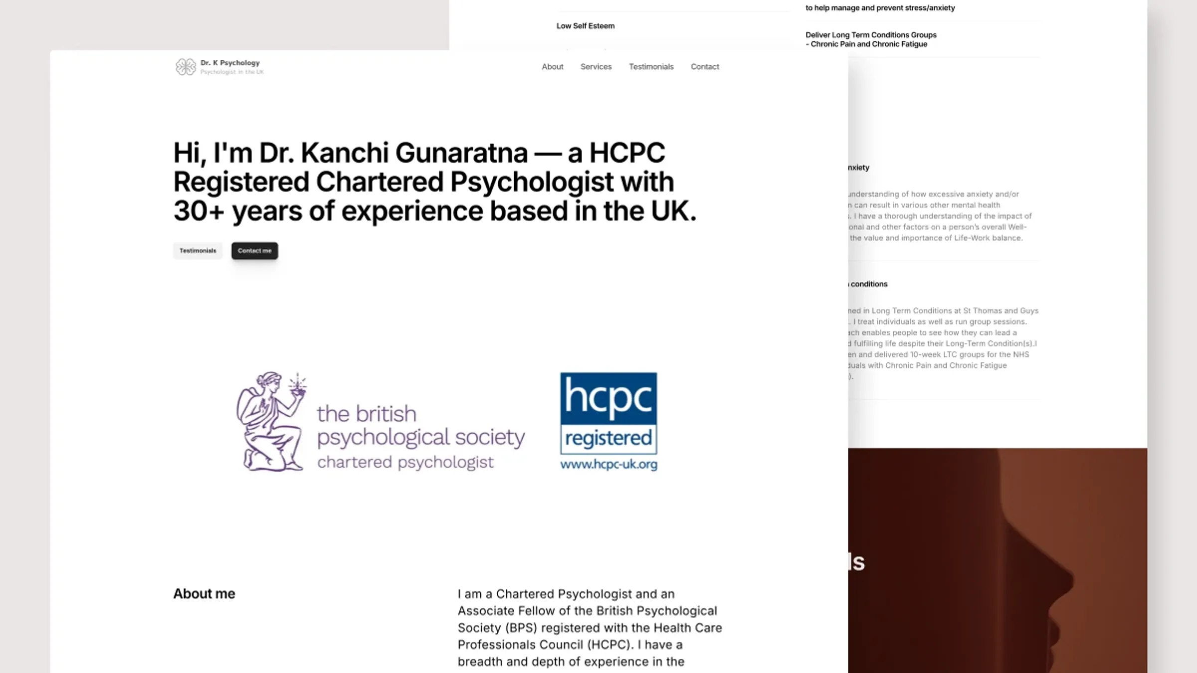
The previous site was partially broken and not reliably accessible. The new one-page site now supports Dr. K's regular client work — a stable, current place to present the practice and receive inquiries, maintained without technical help.
01Background
Dr. K is a UK-based psychologist working with a range of mental health difficulties. This was close to a fresh build rather than an iteration: a one-page site, easy on mobile, simple to maintain — something that works for the therapist and for people looking for help.
02Understanding the visitor
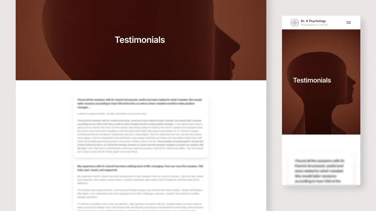
Research into how people look for therapy shaped two hard requirements: most health searches happen on phones, and over 70% of people lean on reviews when choosing a provider. So: mobile-first, and reviews impossible to miss.
A persona — Anna, 34, anxious, searching in the evenings after stressful workdays, first time looking for a psychologist — kept the design honest. Every extra decision on the page is a cost to someone already overwhelmed.
03What I did
- One-page structure: understand the whole offer in a single scroll
- Clear hierarchy around three questions: is this a fit, how does it work, what's next
- Contact without a form — direct email and phone links, so no sensitive data sits in a web backend
- A structure Dr. K updates independently, keeping content current
04Reflection
Calm is a feature. For a visitor who is anxious or overwhelmed, the kindest design is the one that asks the fewest decisions of them — and makes the next step obvious.
Want the full process — research, iterations and the feedback that changed the design? Read the extended version →