Extended case study · Healthcare · UK
Helping visitors feel sure a therapist is the right fit
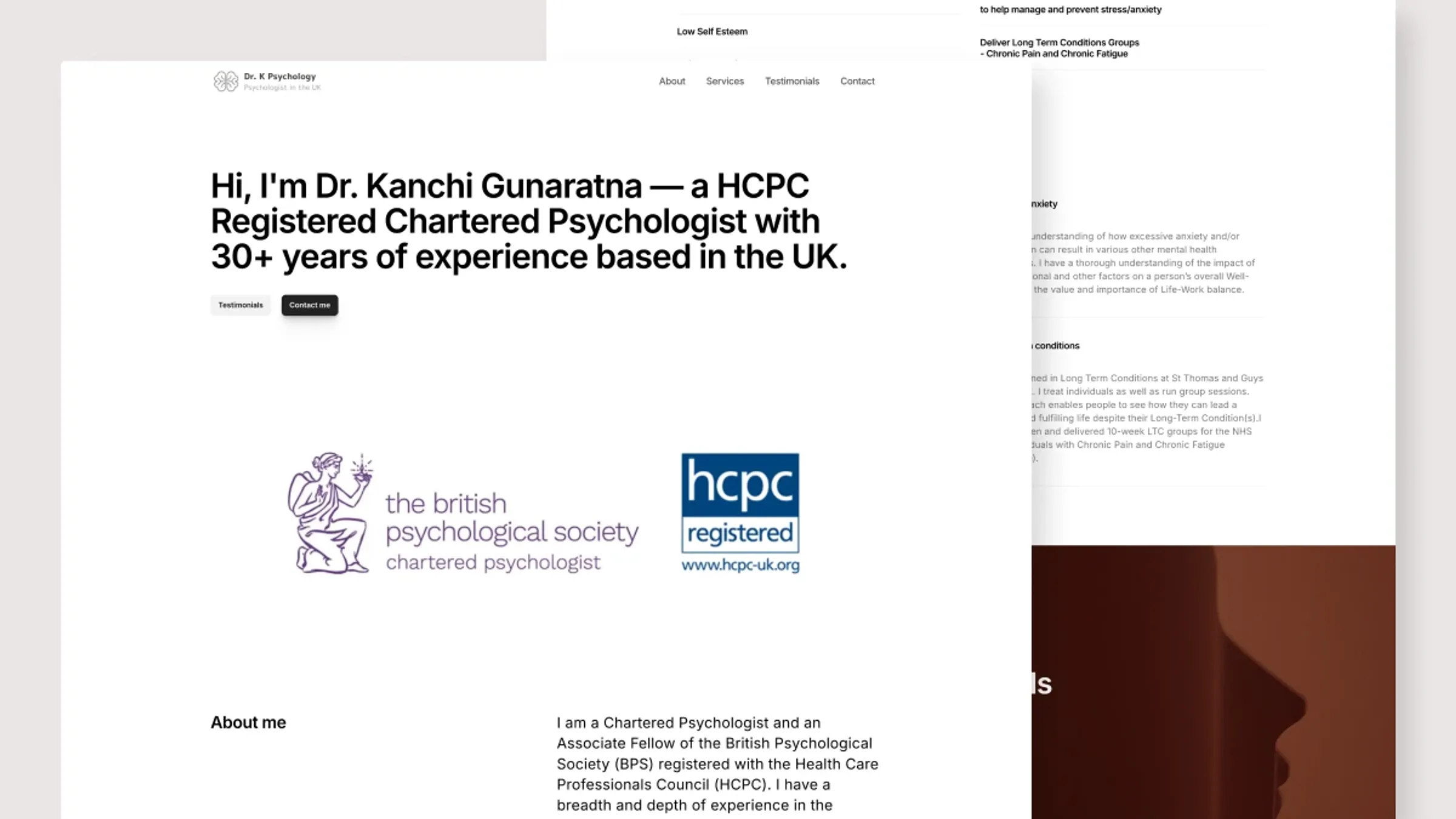
Extended case study — includes research, iterations and feedback rounds. Short on time? Read the condensed version →
TL;DRThe outcome
The previous site was partially broken and not reliably accessible. The new one-page site is now a stable part of Dr. K's practice: it presents the work, brings in inquiries, and stays current without technical help.
01Background
Dr. K is a UK-based psychologist with experience across a range of mental health difficulties. The old site was close to unusable, so this was a fresh build rather than an iteration. The site has exactly two jobs: help visitors decide if Dr. K is a good fit, and make it easy to get in touch.
02Research into how people choose a therapist
Before designing anything, I looked into how people use therapy websites, how they search for health information, and how reviews shape health decisions:
- More than half of adults look up health information on their phones (Pew Research). Mobile isn't an edge case here. It's the main case.
- Over 70% rely on reviews when choosing a healthcare provider (Reputation, 2022).
That gave me two firm requirements: the site had to work well on mobile, and reviews had to be easy to find and read.
Sources
- Pew Research Center (2012). Mobile Health 2012.
- Reputation (2022). Over 70% of Consumers Read Online Reviews When Considering a New Doctor.
03The user: designing for a hard week
I've been searching for a psychologist in the evenings after work but it's been so hard picking one.
Anna, 34 — persona built from the research
Anna has felt anxious and tense for months. It's affecting her sleep, her relationships and her work, and this is her first time looking for a psychologist. She's searching on her phone, in the evening, already tired. Every extra decision the page asks of her has a cost.
Goals
- Find a trustworthy professional
- Understand what therapy would be like
- Get in touch without a complicated process
Behaviors
- Searches on her phone in the evening
- Skims — walls of text lose her
- Looks for reviews
Frustrations
- Hard to focus on long text
- Unsure which credentials matter
- Worried about choosing wrong
Needs
- Easy-to-find client reviews
- Clear, focused content
- Obvious next steps
04The solution, section by section
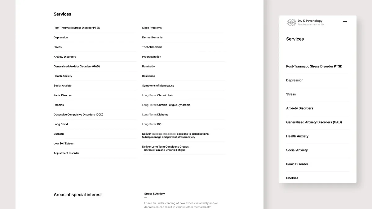
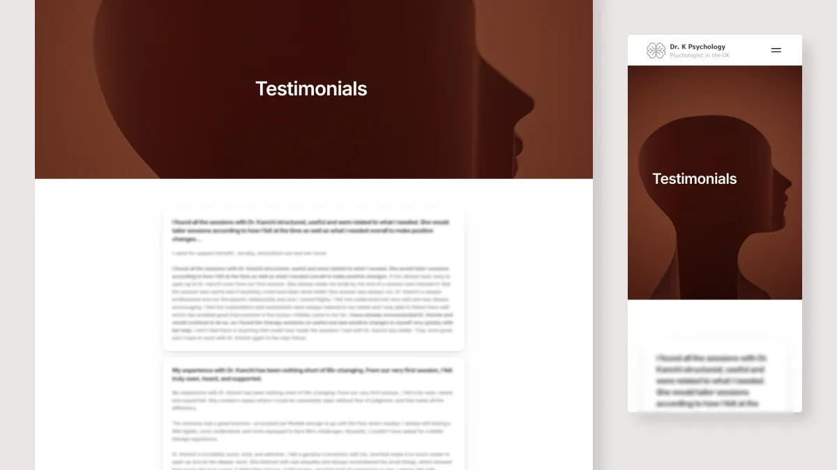
I used a one-page layout: the full picture in a single scroll, moving from credentials to approach to services to reviews to contact. One decision worth being open about: I first built the site on a more complex platform. It made edits too hard for the client, so I rebuilt it in Framer. Maintainability mattered more than the work I'd already put in.
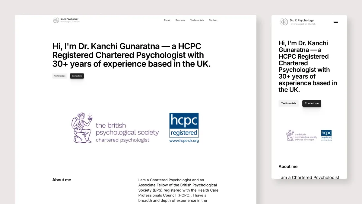
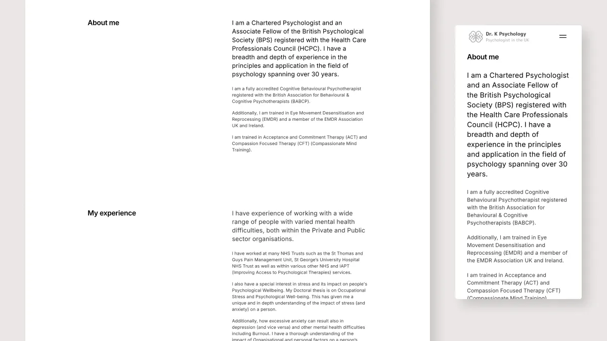
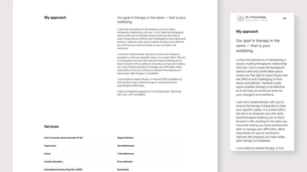
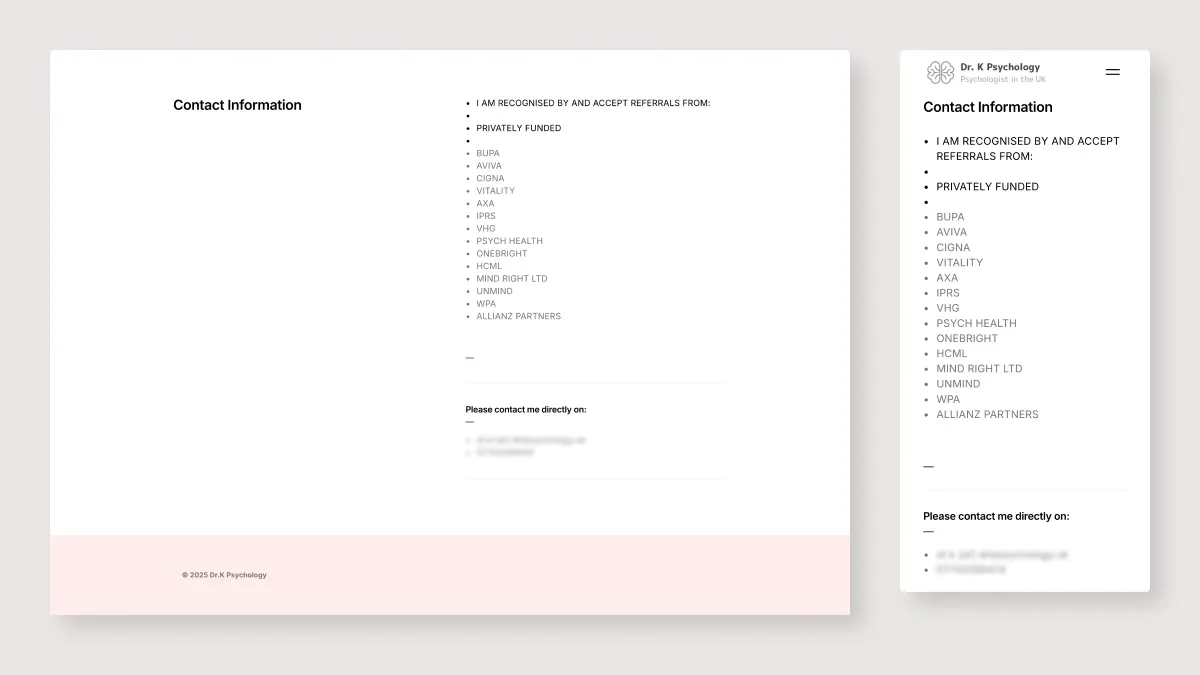
Contact without a form. Referral options, email and phone links instead of a contact form. Nothing sensitive gets stored in third-party tools, and it fits how Dr. K already works. The trade-off is less structured inquiries. For a therapy site, privacy wins.
05Impact, and trade-offs made on purpose
We didn't track detailed metrics for this project. What I can say: the site has run as a stable part of the practice since launch, presenting the work and handling new inquiries, and Dr. K keeps it updated with light support from me. The one-page layout traded SEO depth for visitor clarity. The platform switch traded features for maintainability. Both were deliberate.
06What I learned
- Keep the user and the problem statement close. Coming back to Anna killed every “nice-to-have” idea before it cost anything.
- Use data to make and explain decisions. The research helped me choose with confidence and helped the client understand why.
- Make trade-offs on purpose. Naming what you're giving up, out loud, is what separates a decision from an accident.