Extended case study · Education · Japan
Enabling students to find an English course that fits their goals
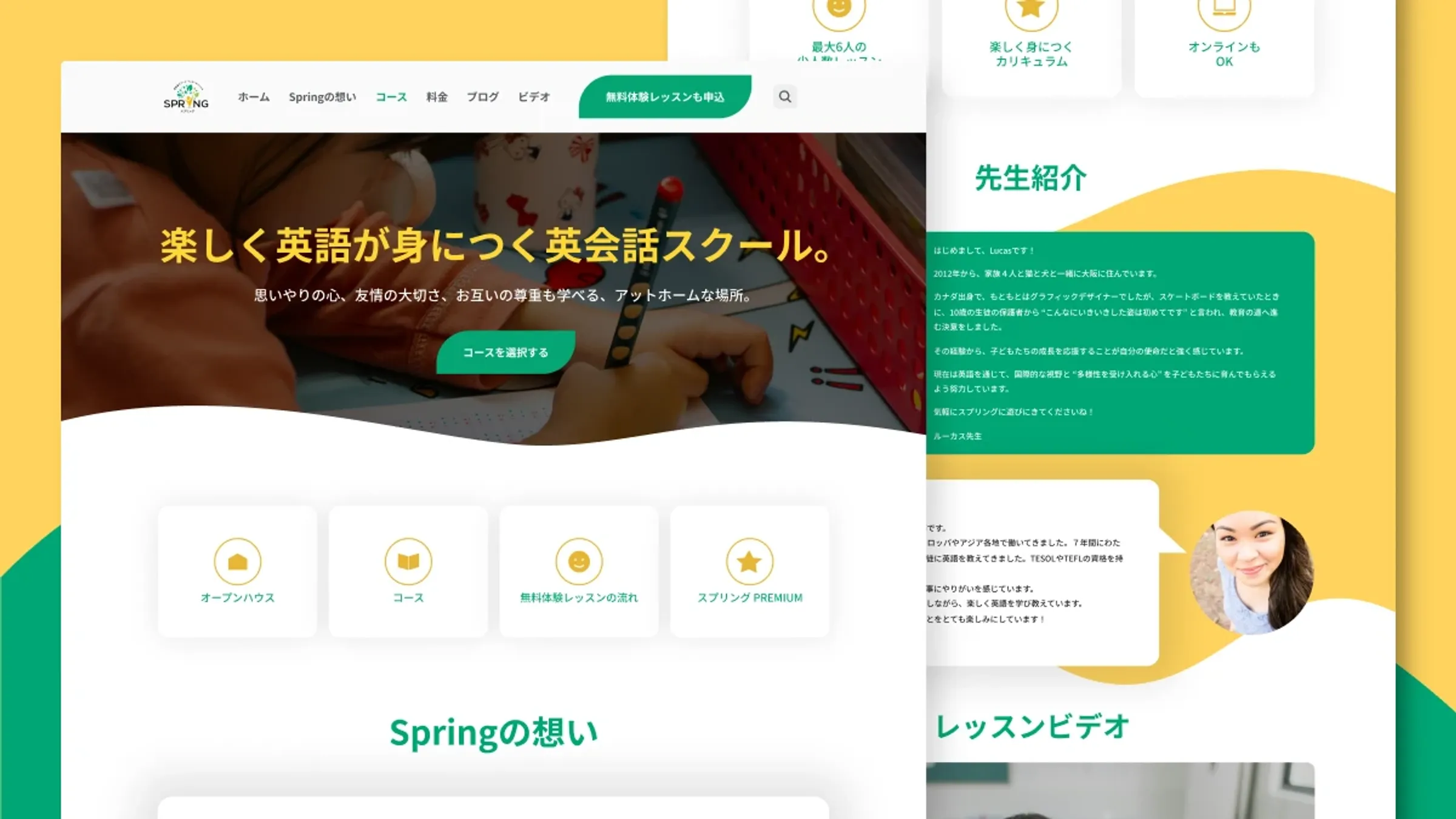
Extended case study — includes research, iterations and feedback rounds. Short on time? Read the condensed version →
TL;DRThe outcome
Every age group, from toddlers to adults, shared one crowded page. I gave each course its own page and the staff a system they could run themselves. Comparing similar six-month periods (the redesign launched alongside other growth work):
- 58% more visitors exploring courses
- 44% longer time spent on the site
- 22% more pages viewed per visit
01Background
Spring Learning is an English language school in Japan with courses across ages and skill levels. Students struggled to find the right course. Staff struggled to keep the information current. So the project had two goals from day one: redesign course discovery, and build something a non-technical team could maintain on their own.
02The challenge
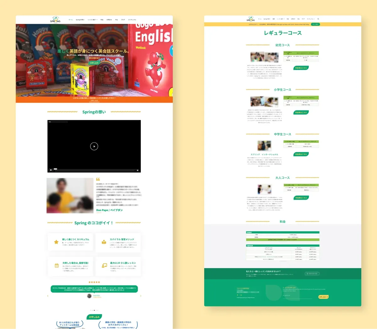
- Everything on one long page. Parents of toddlers and adult learners landed in the same place and scrolled past everyone else's courses to find their own.
- Not enough detail to decide. No curriculum, teacher background or learning outcomes. Parents emailed the school for basics.
- Hard to maintain. Whatever I designed had to be easy for staff to update without me.
03Deciding what mattered
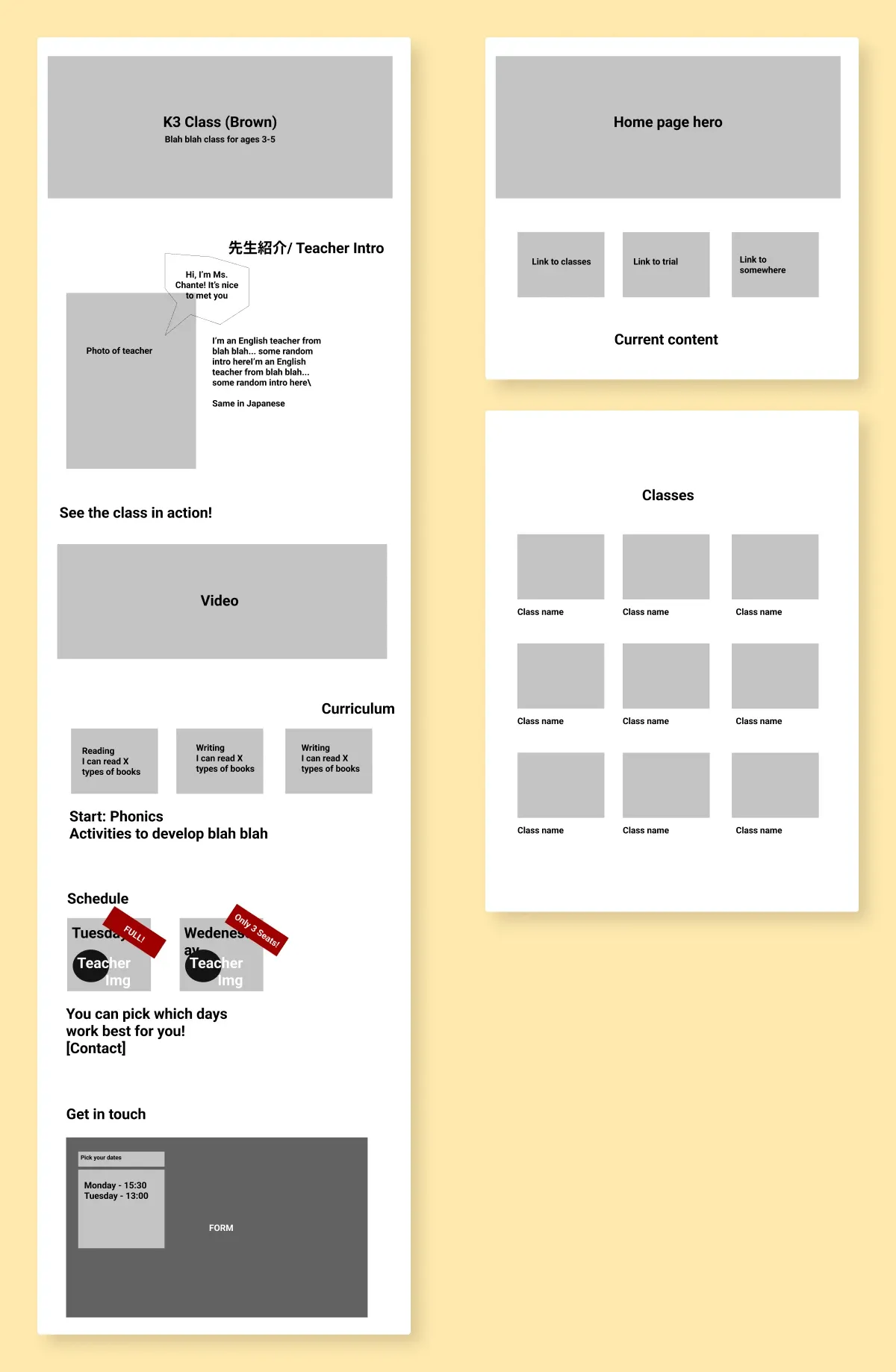
With the staff. The team knew parents wanted more detail, but not which details. We worked it out together and landed on curriculum, teacher, learning outcomes and trial lessons. I used quick wireframes to confirm the direction before building anything, which caught misunderstandings while they were still cheap to fix.
With the market. I reviewed how schools like AEON, Nico Kids and ECC organize courses. Most use age-and-level groupings, dedicated course pages, and a “Point 1/2/3” highlights format that Japanese visitors already know how to read. I kept those conventions so visitors could focus on courses instead of navigation.
04The key decision: one page per course
I seriously considered one improved comparison page instead. We weighed it up:
Single comparison page
- See all courses at once
- Less clicking
- But: too much information in one place
- But: no tailored messaging per age group
- But: no way to link to one course
Dedicated course pages
- One course, one focus
- Shareable links
- Room to show what makes each course different
- But: more clicks to compare
- But: more pages to maintain
We chose dedicated pages. Detail wins decisions, and templates cover the maintenance cost.
05The solution
Organized by age and level, with the homepage linking straight into the course directory.
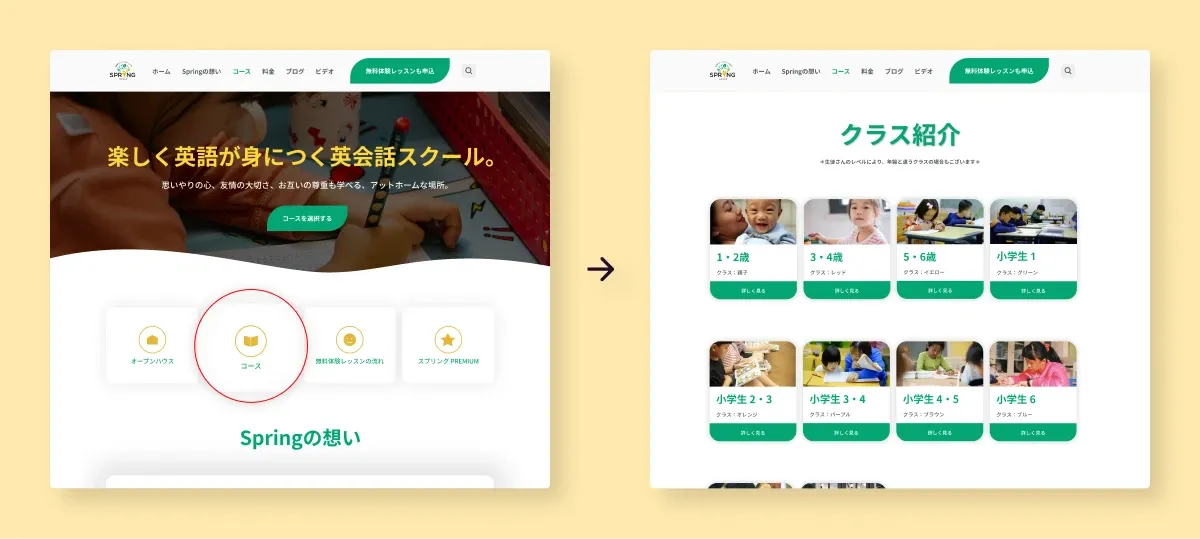
Every course got its own page: goals, teacher, curriculum, schedule and pricing, with messaging written for its age group.

Templates the staff run themselves. Course cards, curriculum sections, teacher bios and buttons as reusable Elementor components. After launch, staff added courses, launched new programs and ran a blog without design help.

Accessibility with real numbers. Button contrast improved from 2.19:1 to 13.12:1, with refined typography, spacing and hierarchy throughout.

06Impact over time
The redesign launched in 2022 and I supported it through 2024: adding courses, watching the analytics, optimizing for mobile as more visitors switched to phones, and scaling the template system as programs grew. The design stayed in production until new owners acquired the school and moved platforms. A good run for a school website.
07What I learned
- Plan the content structure early. Settling the organization first made every later design decision easier.
- Design for the people maintaining it. Too much template freedom and the site gets messy. Too little and staff feel stuck. Finding that balance was one of the most interesting parts of the project.
- Local conventions matter. The “Point 1/2/3” format wasn't my invention. It's what language-school visitors in Japan already read fluently, so I adapted it.
- Accessibility can mean trade-offs. Hitting contrast standards inside a fixed brand palette took real conversations with the team, balancing user needs, standards and the brand.
08In the client's words
Lizzie was an absolutely fundamental part of our team when it came to UX design, web development and branding. Every time we needed her expertise, she delivered with unmatched skill, professionalism, and creativity as a full-stack designer.
Her ability to take even the most complex vision and break it down into an understandable and actionable project was nothing short of remarkable. She communicated exceptionally well throughout every stage of the process, ensuring that everyone was on the same page and that the final result exceeded expectations.
Whether it was creating a stunning logo or developing a sleek, functional website, Lizzie consistently turned ideas into reality with precision and creativity in a way that delivered tangible business results—she was also involved in monitoring site performance, analyzing user data, and optimizing designs to increase conversions. She wasn't just a designer—she was a true collaborator and problem solver. We were incredibly grateful to have had her as part of our team and cannot recommend her highly enough!