Extended project · Campaign for good
Starting honest conversations about PMDD
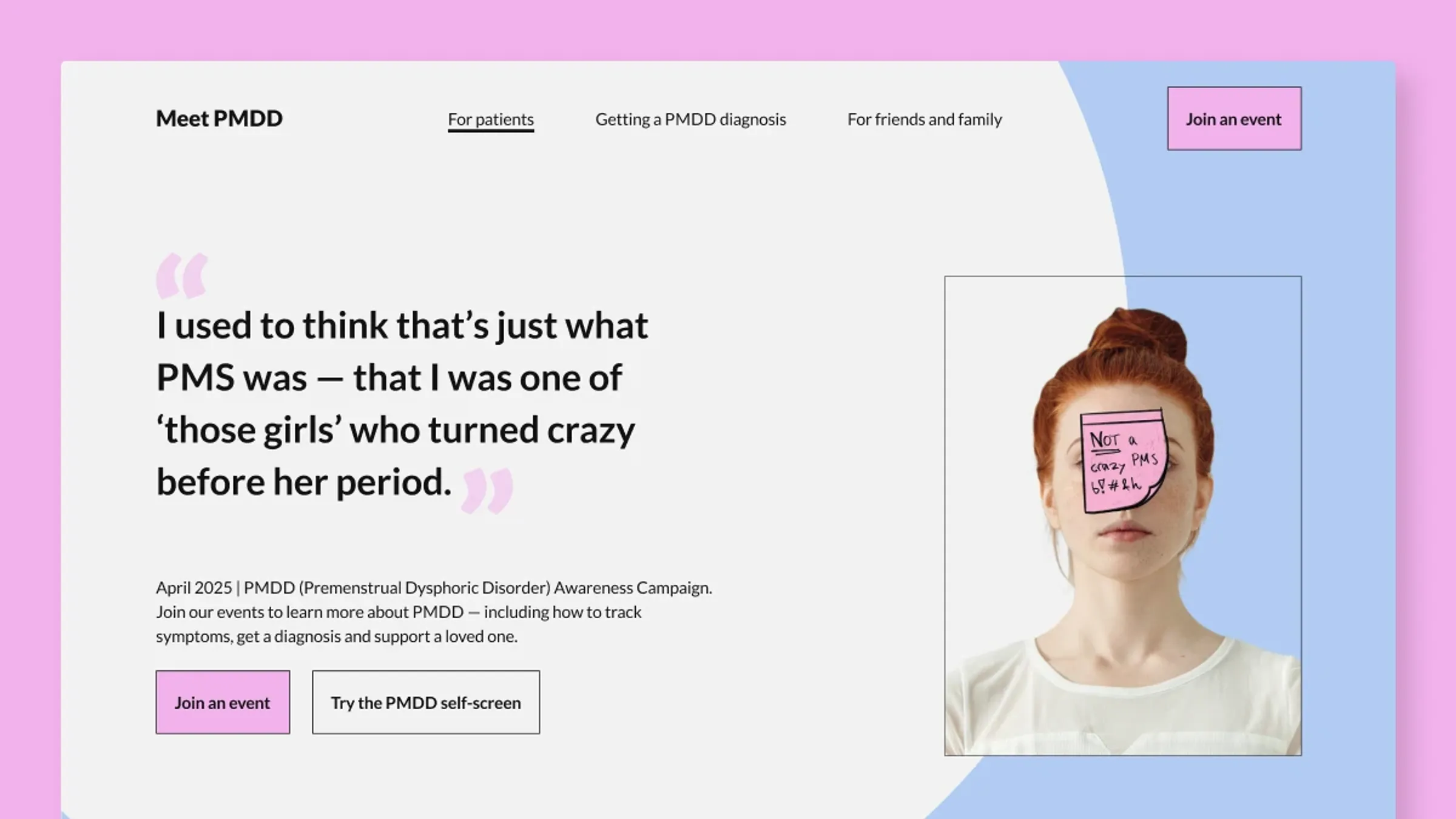
Extended case study — includes research, iterations and feedback rounds. Short on time? Read the condensed version →
01The challenge
An open brief: design a project for social good across at least three mediums, one of them analogue. I chose PMDD. It affects a lot of people, it regularly gets dismissed as “just PMS,” and it can be debilitating. That gap between how serious it is and how casually it's treated felt worth designing against.
The campaign had to speak to people with PMDD and to the partners and support systems around them, with the general public as a second audience. It also had to stay recognizably one campaign across very different situations, from private symptom tracking to public awareness.
02Grounding the design
I built the campaign on research: existing PMDD awareness initiatives, women's health projects, medical literature, and interviews about lived experience. That mix set the tone I was after. Some early ideas had the facts but no warmth. Others had warmth but nothing to stand on. The campaign needed both: medically accurate and genuinely comforting.
Sources
- International Association for Premenstrual Disorders (IAPMD)
- McPin Foundation: PMDD Awareness
- Mind: PMDD information for friends and family
- Royal College of Obstetricians & Gynaecologists: Raising awareness of PMDD
- PMS-förbundet: Har jag PMS/PMDS?
03Ideation, and the pivot


The pivot. My first concept was a t-shirt, a wearable sign of solidarity. Feedback from other designers changed my mind: a symbol helps for a day, but a tool helps every day. The t-shirt became an analogue journal for symptom tracking and partner dialogue. The solidarity didn't disappear. It moved into the community events and social media instead.


04One system, three touchpoints


05What I learned
- Sensitive topics need facts and empathy together. Medically accurate and comforting at the same time. One without the other doesn't hold.
- A strong core idea lets touchpoints differ safely. Each audience got content shaped for them, and it still read as one campaign.
- Design for the bad days. What feels clear on a good day can feel exhausting on a bad one. I tested every choice against both.