Extended project · Typography & editorial
The Diary of a Nobody, retold by the housekeeper
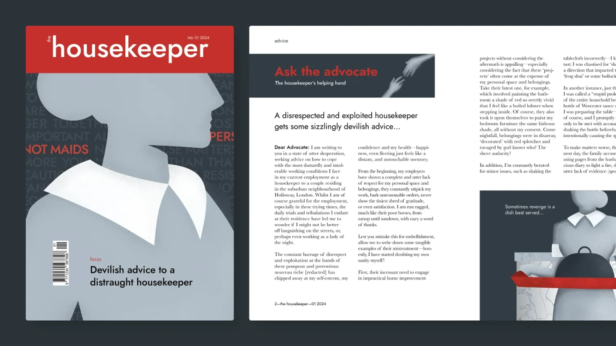
Extended case study — includes research, iterations and feedback rounds. Short on time? Read the condensed version →
01The concept
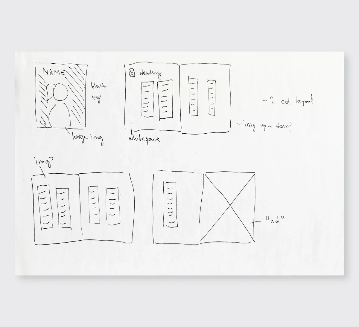
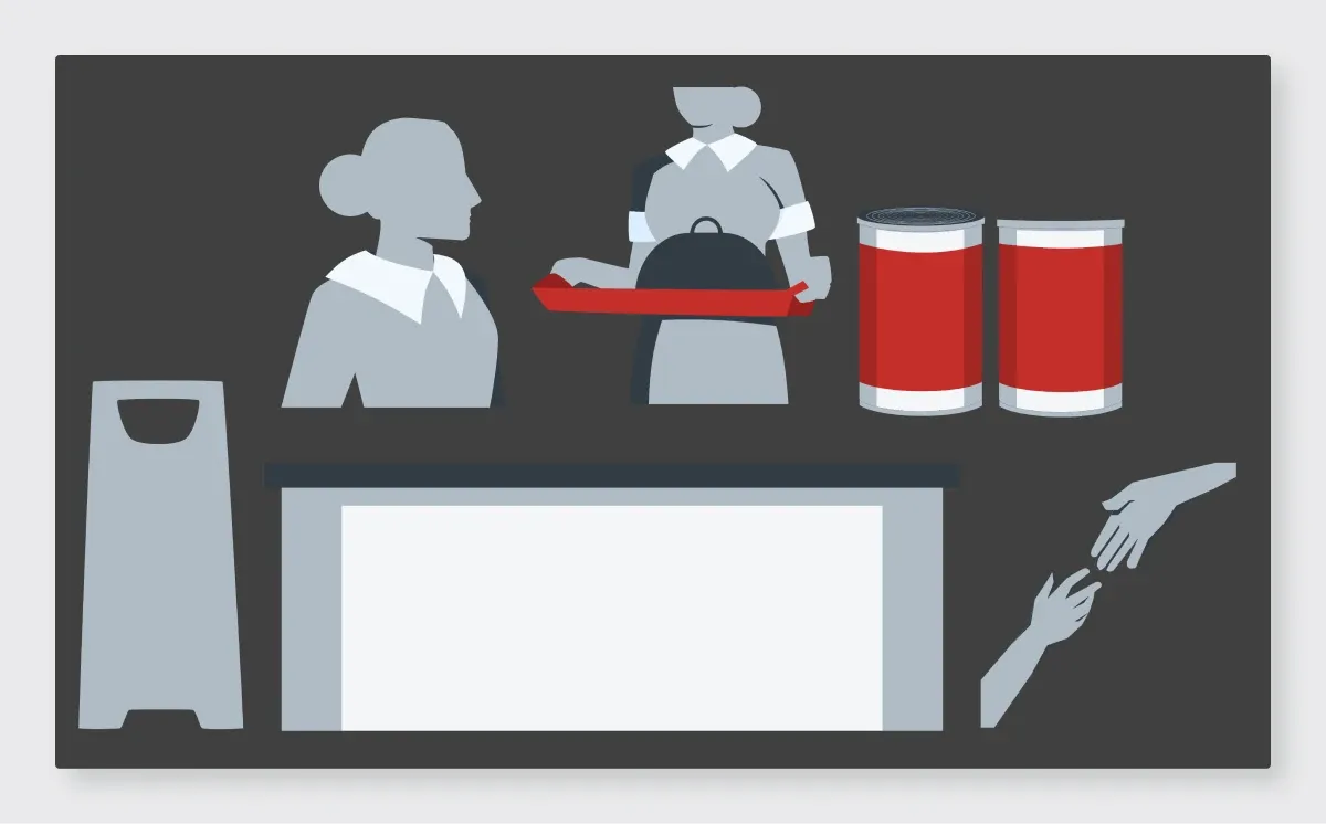
The Diary of a Nobody is a Victorian comedy told by Mr. Pooter, a well-meaning, clueless middle-class clerk. My brief was to turn a book into a magazine article, and the angle I chose was to move the camera: same household, seen by the person who cleans it.
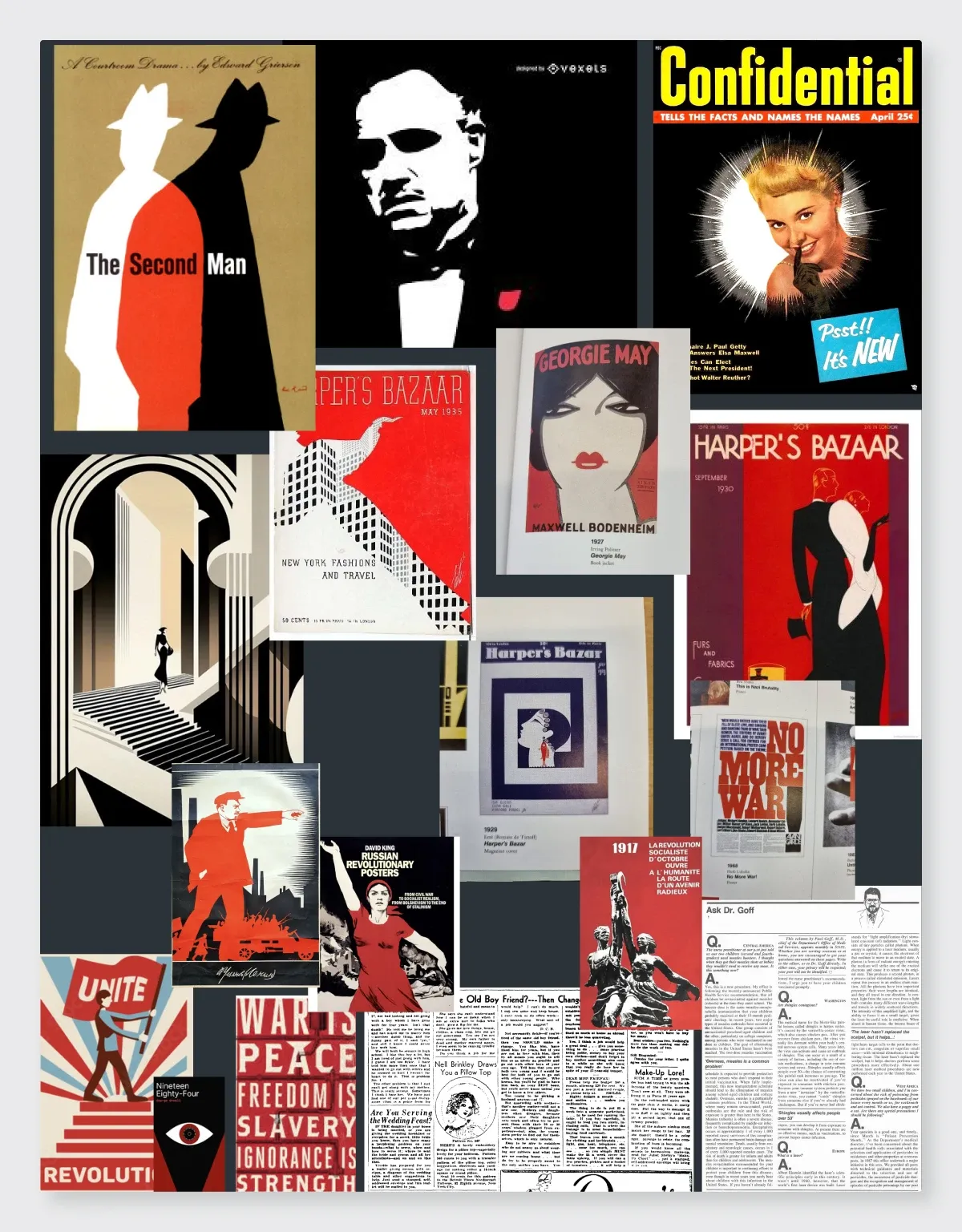
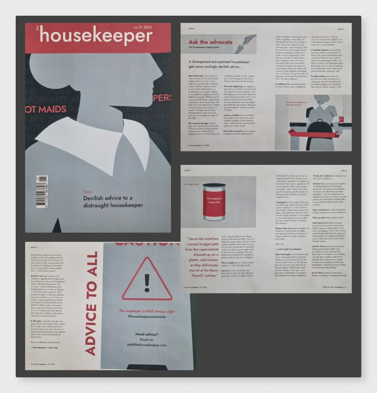
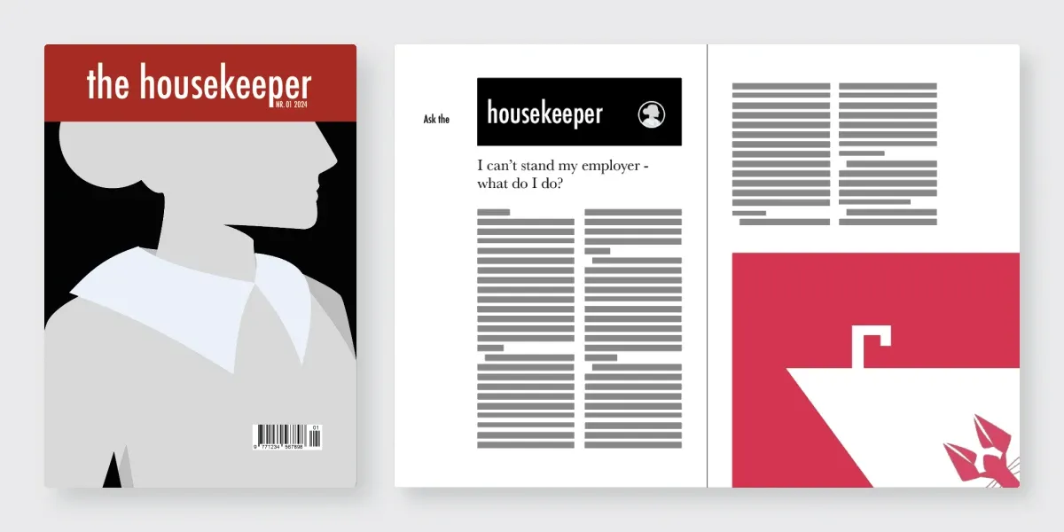
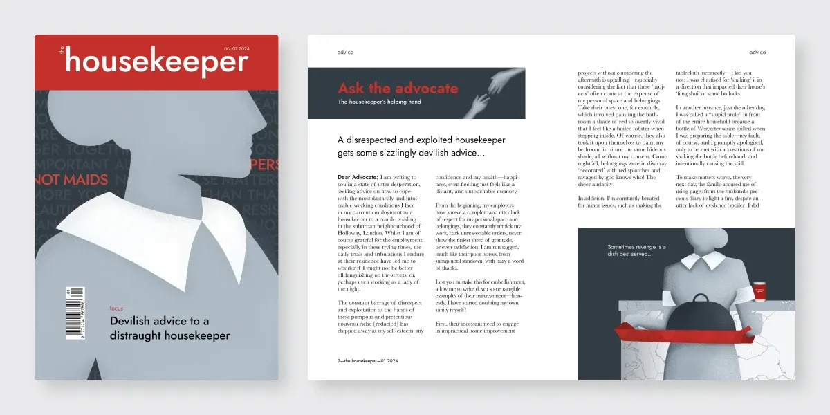
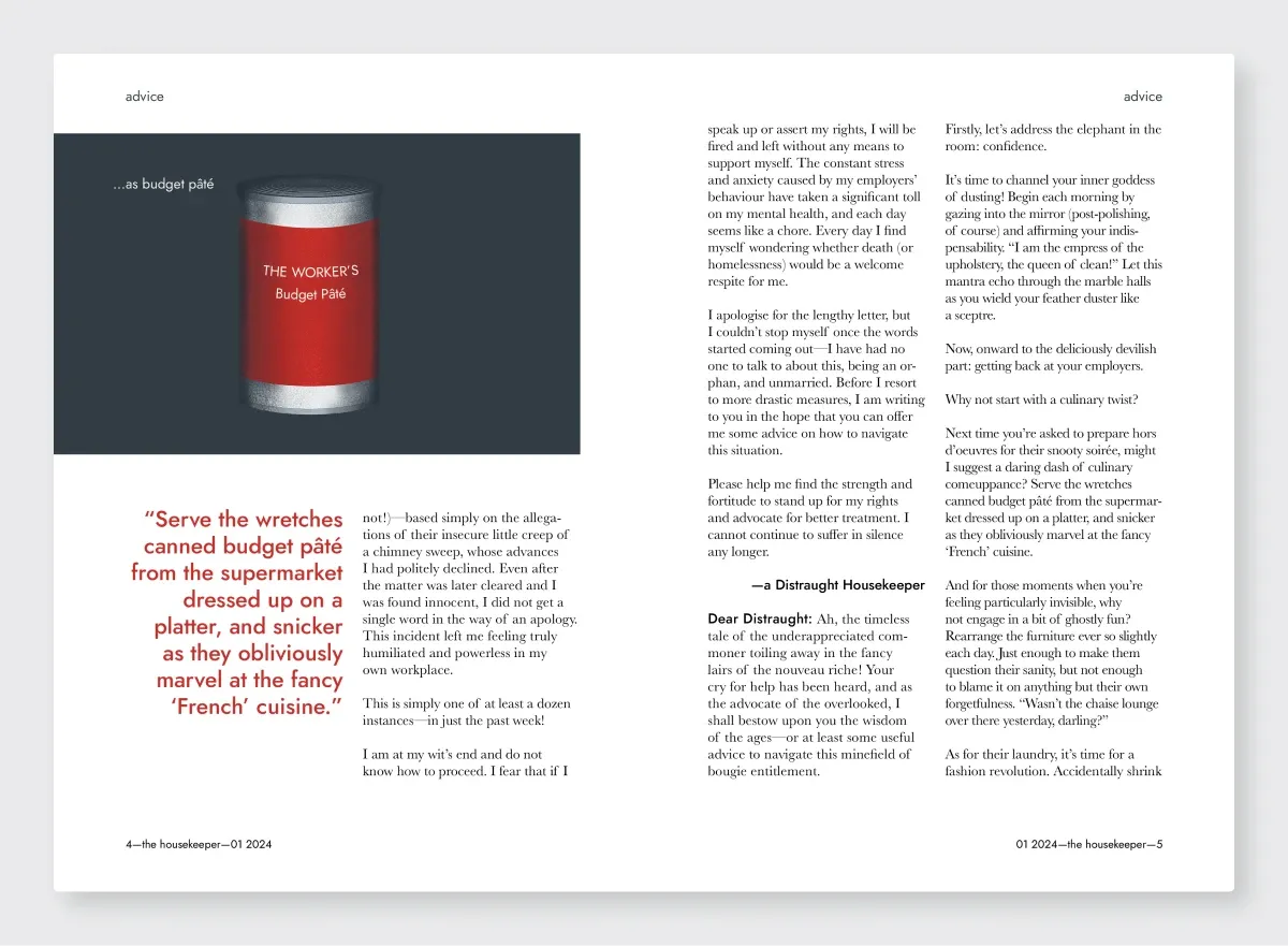
Through typography, layout and imagery, the spread gives the housekeeper a voice and turns light comedy into social commentary about unseen labor and the class divide it rests on.
02Ideation
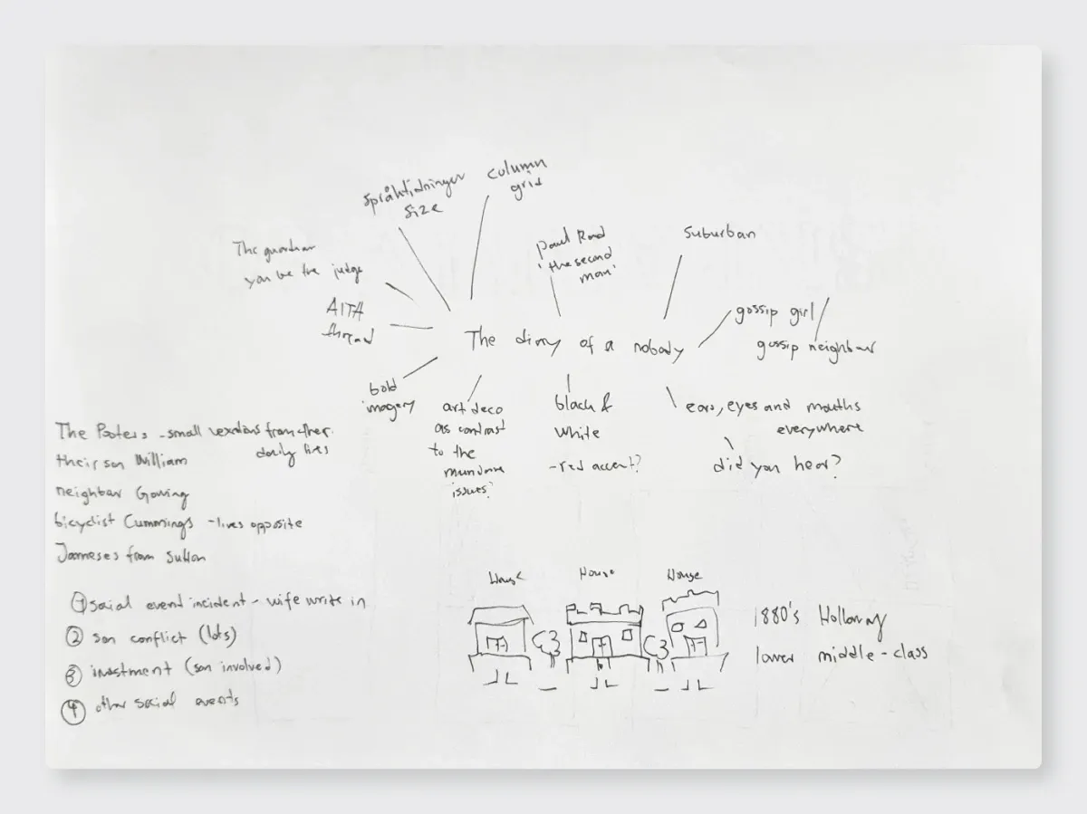
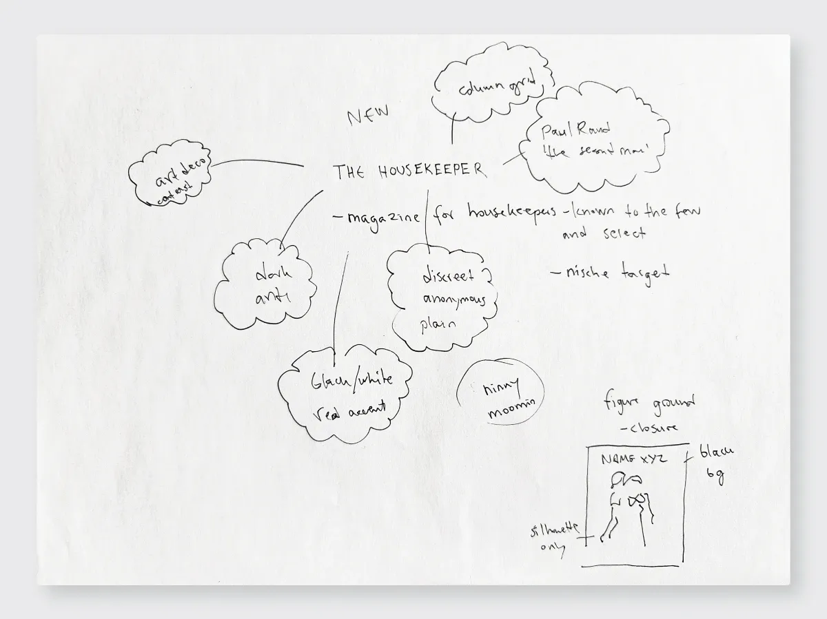
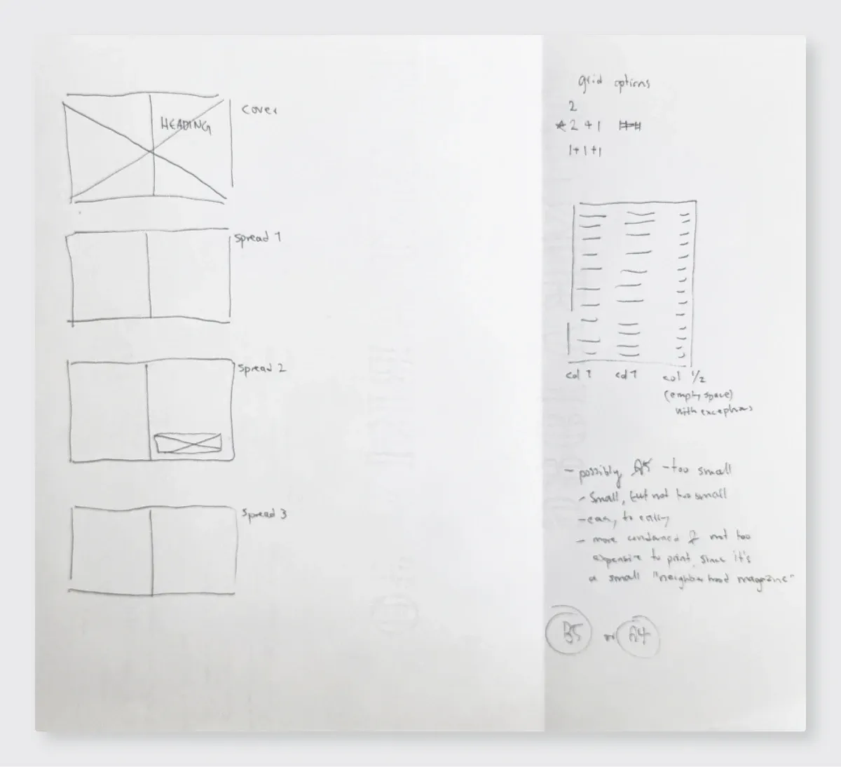
03Building the visual language

04Feedback, and what it changed
Round 1: the final spread's message.
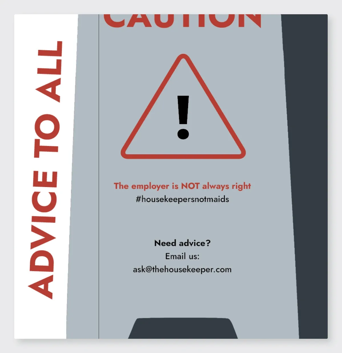
Further exploration of visual elements beyond conventional imagery, such as the “wet floor” sign, presents an opportunity to deepen the emotional resonance of the project.
Design review
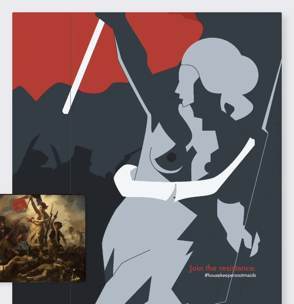
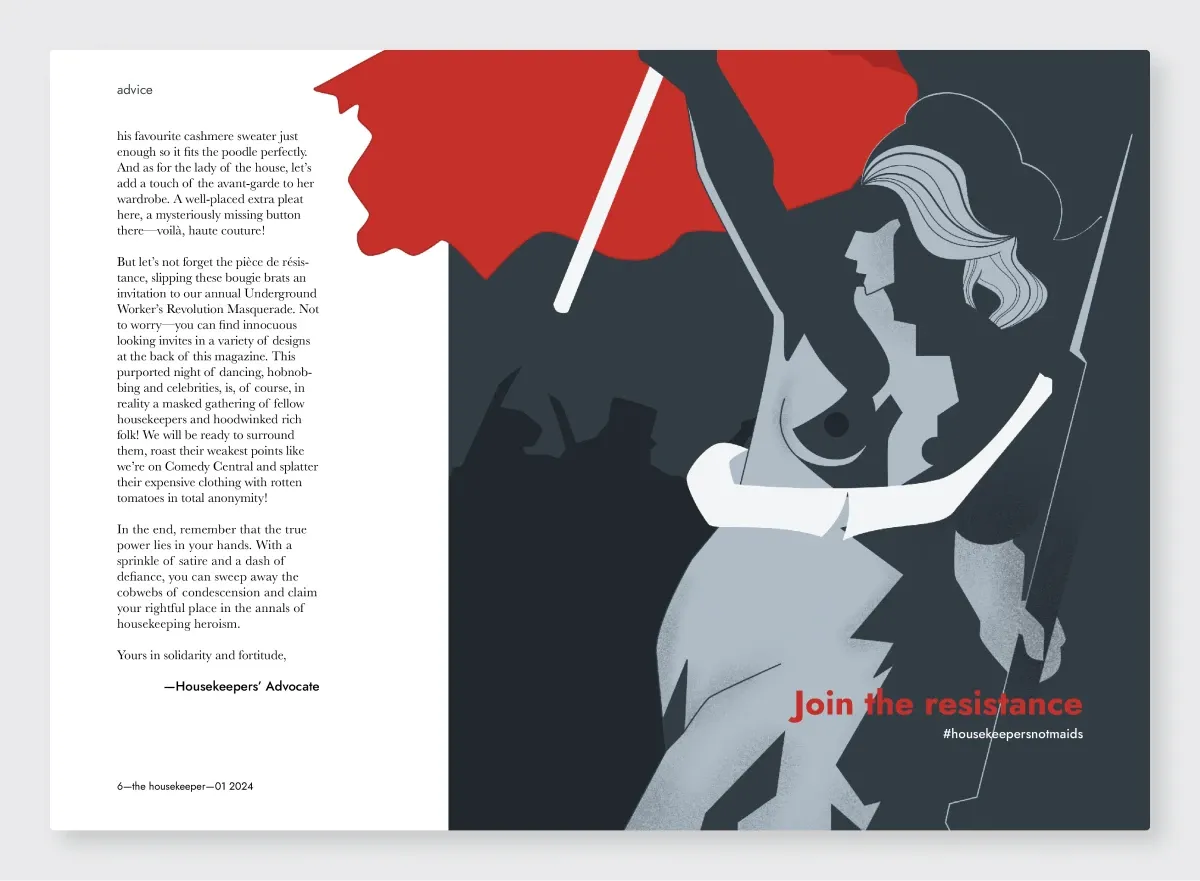
My original closing image was a wet-floor sign. On theme, but it didn't go far enough, and the feedback made me re-ask the basic question: what should this magazine stand for? I replaced the sign with a graphic inspired by Delacroix's Liberty Leading the People. The spread stopped offering sympathy and started calling for action. That was the message all along; the feedback helped me find it.
Round 2: texture and materiality.
Texture and materiality in typography offer a rich avenue for enhancing the project's conceptualization, providing tactile and sensory dimensions.
Design review
I resisted this one at first. My early texture tests fought with the text and felt heavy-handed. Coming back to it later with fresh eyes, I compared a flat version against a textured sample and saw the reviewer was right: the flat version lacked presence. A restrained amount of grain gave the piece the tactility a print magazine needs.


05The final spreads
06What I learned
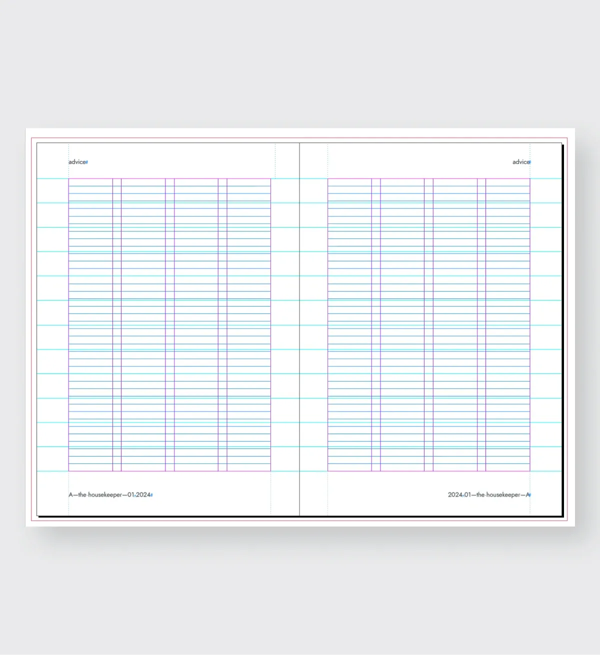
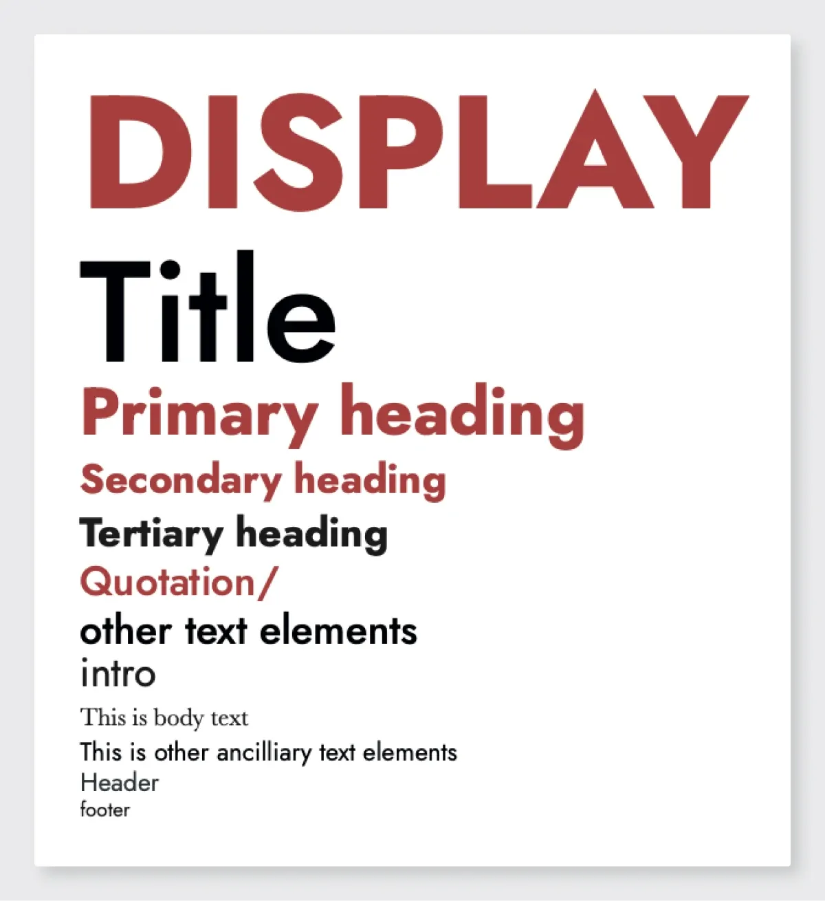
- Type and layout decide things together. The magazine format shaped which typefaces could carry the tone and still read well in print.
- Tight constraints force strategic cuts. Two spreads had to carry the whole counter-narrative, so everything on the page had to earn its place.
- Pick references people can read. Delacroix works because people recognize it. A reference the audience can't place can't carry the meaning, no matter how well it fits.